
Prussian Blue’ is a pigment with an intense, mellow, almost austere yet brilliant colour. Born by chance, it turned out to be a modern and inexpensive synthesis colour, so much so that it was used by the Prussian army to dye their uniforms (and this gave it the name still known today), and for the same purpose also by the Napoleonic army, with its obviously Frenchised name (‘Bleu National’).
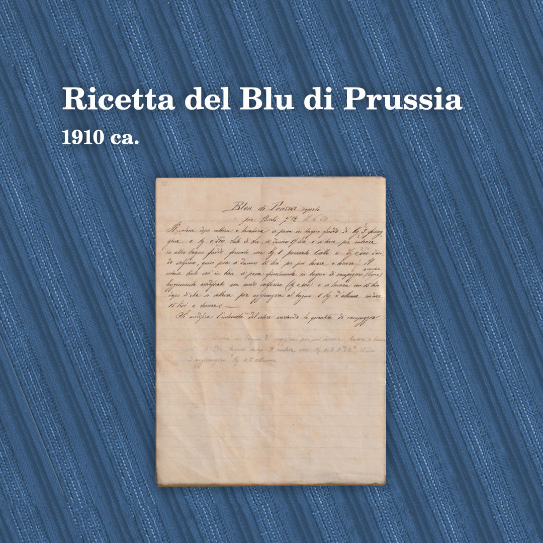
As with all dyes, the recipe for “Bleu di Prussia” also contains adjustments and notes, dyes and fixing agents are used, as in the small booklet of “Ricette dei colori della tintoria, annexa alla tessitura di cotone della ditta Bernardo Caprotti di G. in Ponte d’Albiate“. Dating back to the first decade of the 20th century and carefully preserved in the company offices, it lists ingredients such as ‘yellow prussiate’, the ancient name for metal cyanides, which react with ferric oxide to generate the deep, bright blue colour, or ‘camping’, a colouring powder derived from the South American plant of the same name, which when mixed with cool-toned colours revives their reflections.
Complicated recipe, infinite attention to detail, surveillance on the final product that had to take on a certain colour shade that was typical of the weave from which it was produced.
Perhaps because of all these characteristics, very close to his nature, my father Bernardo was even obsessed with ‘Prussian Blue’. It also explains the first logo he wanted forEsselunga, which was deep blue in colour. It must have taken him a considerable amount of time before he found the shade he liked, that ‘Prussian Blue’. Or rather, ‘Bleu’, as in the old recipe book he certainly knew well. Probably the transition from the Supermarket brand to the blue logo was overseen byArmando Testa, who had started working with my father in 1977.
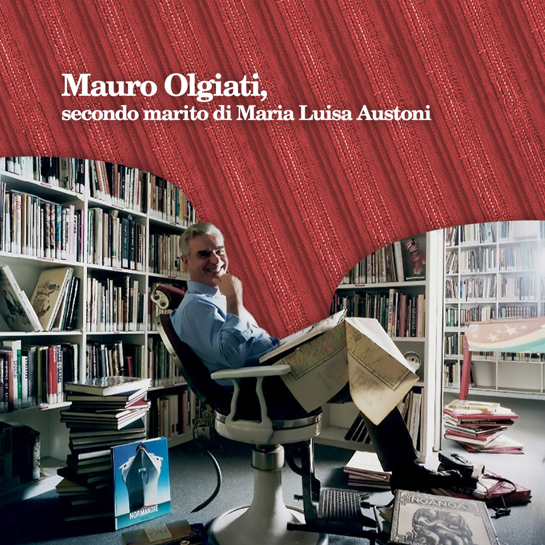
He told me about this ‘obsession’ from Mauro Olgiati, a fine artist and collector of books that gave him a giant map of the world in images, which inspired his talent. Mauro was my aunt Lu‘s partner and then second husband, after her divorce from Guido Caprotti, Dad’s second brother. At the end of the 1990s the opportunity arose to work with him for Esselunga, after my sister Violetta had left.
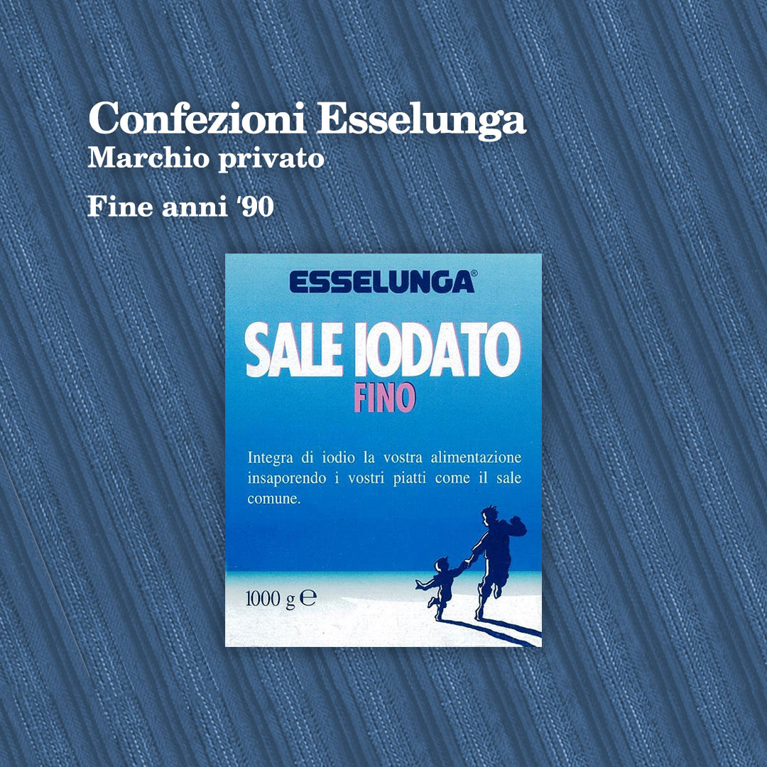
Olgiati had already worked with Bernardo some time before, and had an agency under contract with Italian Supermarkets. For Esselunga he designed the packaging for two private label products: salt and baby nappies.
Unpublished sources:
Manifattura Caprotti archives, “Ricette dei colori della tintoria, annexa alla tessitura di cotone della ditta Bernardo Caprotti di G. in Ponte d’Albiate”, c. 1910,
