
“Among Bernardo’s merits right from the start was that he had Swiss graphic designer Max Huber design the company’s sign and logo with the top of the ‘S’ stretching across the entire word ‘Supermarkets’. The Americans had initially expressed a preference for a fancy name, e.g. ‘Daisy’. Our father convinced them instead to go for ‘Supermarket’, since in 1950s Italy the word was not yet circulating and ‘it was very American’. With the passage of time and the spread of other operators, however, the name ‘Supermarkets’ began to create some problems, because not being registerable exposed the company to not being clearly identifiable by customers. However, its weakness is counterbalanced by the strength of the brand name, the elongated ‘Esse’ designed by Huber.
The success was such, our father would tell us, that an industrial giant of the time such as Carlo Erba, when it tried to enter the large-scale distribution business, also used a sign recalling ours. He reacted by opening a legal dispute to claim exclusivity and, at the same time, asked Huber to think of an alternative, in case we lost in court. That’ s how ‘Naturama’ was born: a brilliant intuition, which our father liked perhaps more than ‘Esselunga’ itself, but which was immediately put away in a drawer, because the Court of Milan proved us right and so the need for change was removed. “Supermarkets”, however, over time became too generic anyway and so, in the 1970s, the definitive one was adopted, taking advantage of the fact that customers spontaneously began to call us “the supermarket with the long esse”. The new “Esselunga” logo was designed by the famous advertiser Armando Testa, and Bernardo, even later, insisted that the elongated “esse” always be recalled – an example is the yellow delivery trucks for home shopping, which lacked it in the beginning – so as not to break the link with the origins.” (pp. 133-134).
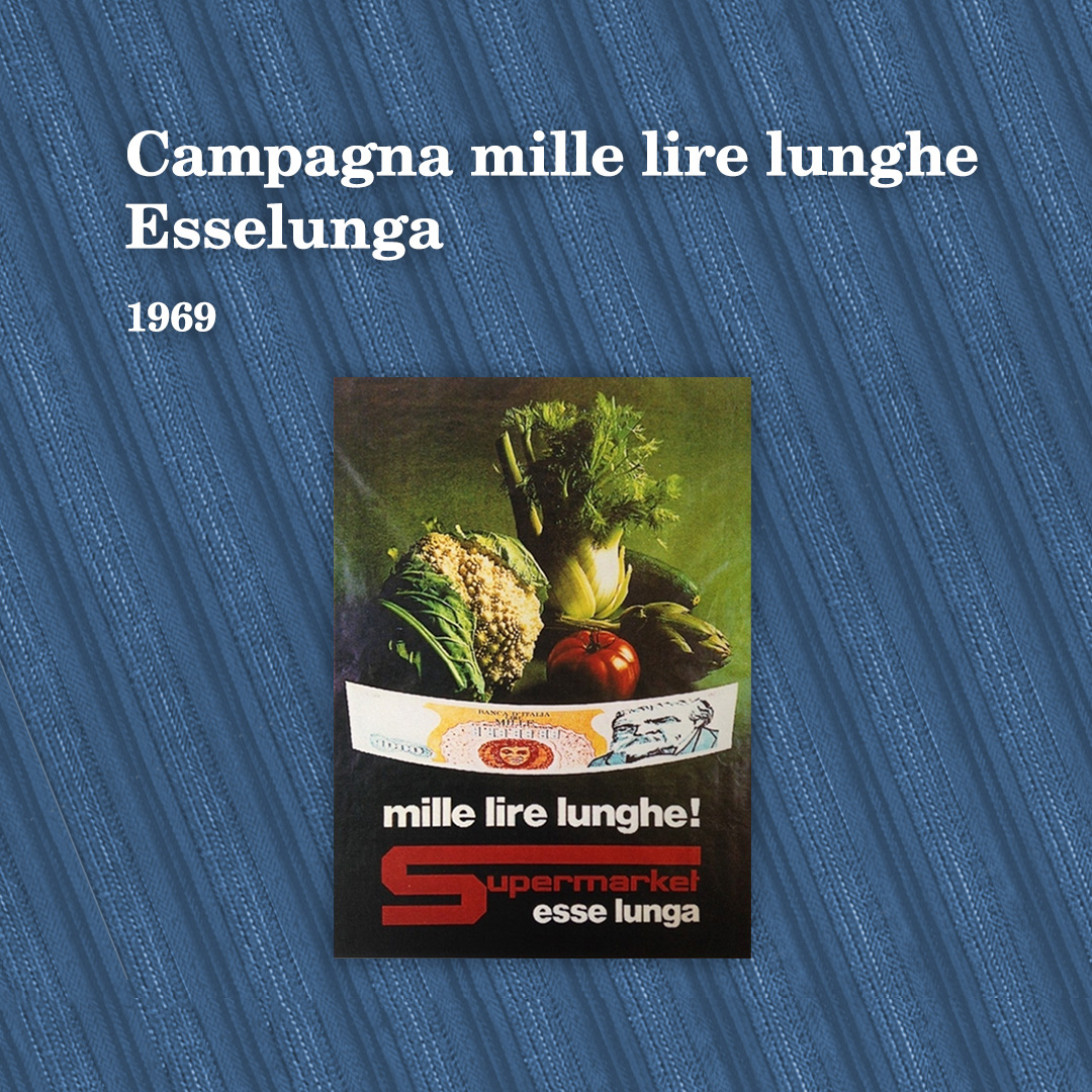
Uncle Claudio [Caprotti], my father’s last brother, told me that the name Esselunga came about at the time of the ‘Mille lire lunghe’ (one thousand lire long) promotional campaign (1969 – 1971), curated by Alberto Gandin, one of the leading Italian advertisers of the time. An elongated 1,000 lire note embraces a selection of vegetables that, ‘not by chance (…), give the sensation of freshness, which was to become a strong point of the company (…).
The slogan was ‘come and spend 1000 lire long at the supermarket with a long S’. From then on, customers started to call the supermarkets ‘Esselunga’, which would become the name of the operating company while the holding company would continue to be called Supermarkets Italiani.”
The ‘esse’ had already changed from white to red, and its incisiveness made the ‘mille lire lunghe’ (which was also a gadget, a bookmark distributed to customers), one of the best advertising campaigns of the category.
The Max Huber Archive in Lugano (CH) preserves, among others, two logo studies for Supermarkets, one with the lettering alone and one with the lettering inserted in a metal structure to be fixed on buildings.
![]()
The drawings shown in the image are preserved in the Huber Archive, Lugano (CH), inventory numbers 1254 and 1255. Courtesy of Ahoi Huber Kono.
External bibliographic references:
M. MOTTA, Esselunga creates a Wonderland euphoria, in ‘Promotion’, 21/04/2017.
